petukhouskaya.design@gmail.com
Paperpile

Introduction

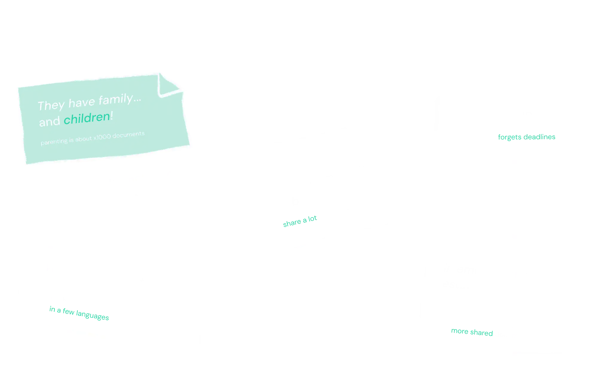
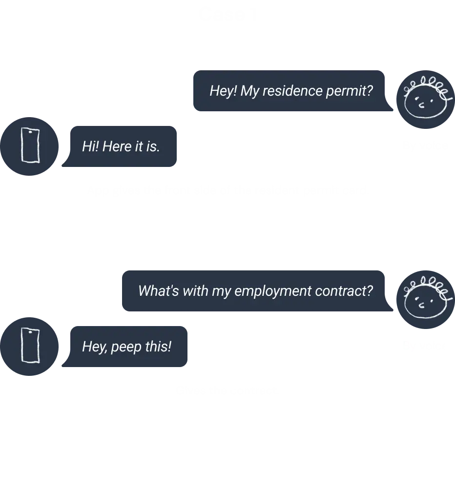
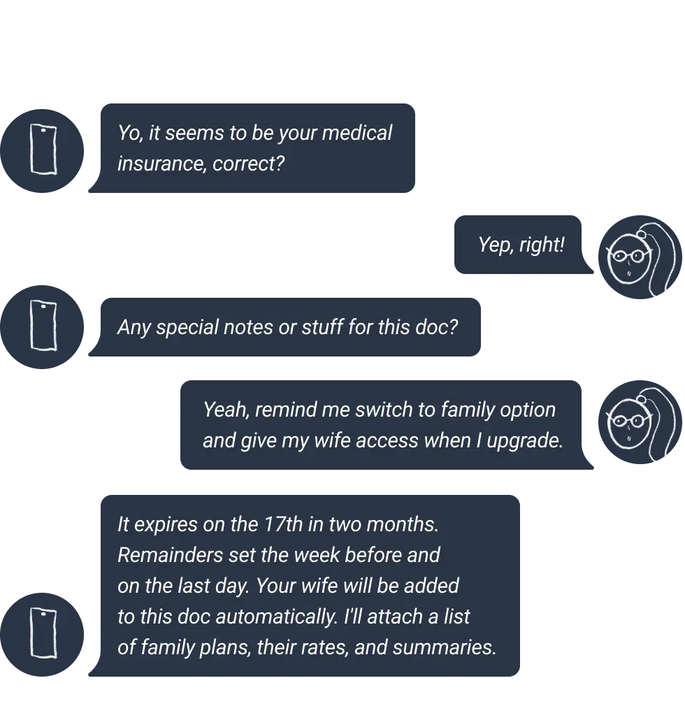
Managing an overwhelming variety of documents has become a persistent challenge. Documents are often dispersed across emails, cloud drives, messaging apps, and personal notes, taking up valuable phone storage and making organization difficult. This disarray leads to frustration and inefficiency, as people spend excessive time searching for specific documents, worry about losing important files, or risk missing critical deadlines like expiration dates. The lack of a streamlined system leaves many feeling disorganized and anxious.

Facing this issue being immigrants, the team started to explore the problem more globally when I joined them.

How it started

Immigration and Documentation Challenges

Political changes in Western Europe have triggered waves of immigration, bringing new challenges for many.
Among the most pressing is managing documentation for tasks like legalizing status, renting property, or finding work. These processes are often hindered by language barriers and differing administrative systems.

Complex Document Handling

Immigrants must often handle not only original documents but also translated and legalized versions, adding complexity to an already difficult process. This can create significant stress, especially for those unfamiliar with the host country’s bureaucracy.

Shared Responsibilities Increase the Strain

Families, business owners, and groups face even greater challenges when managing shared documents. Efficient organization and accessibility become critical to avoid confusion and delays.

Need for Streamlined Solutions

These growing challenges highlight the urgent need for a streamlined system to simplify documentation processes and improve accessibility at least for immigrants and their families.

What I learned, my own Aha-moment:

My teammates who had children faced challenges with managing their children's documents, a context that wasn’t immediately obvious to me. I first became aware of this issue through my designer colleague Dina, who shared her struggles during our brainstorming sessions. This led me to explore it further through in-depth interviews with respondents who also had children. We discovered that managing the sheer volume of children's documents was a common pain point for most of them, so we made it a key focus.

Designer (me) + the team

I joined the team at the moment when my designer mate Dina had already started working on a few wireframes and a visual mood board for the interface concept. I was first of all to provide my product, UX, and UI expertise.

Here I summarise a few crucial insights I gained during design work from deep interviews and discussions that impacted major product development twists.

Market forecast

Pandemia boosted the remote work.
The war and recent political events have caused of a global displacement of people.
AI development is transforming
the mobile apps market (and the world).

Trends

  • Interactions evolve into true Assistants through customization, proactivity, an appropriate tone of voice, and a predictive, behavior-driven approach.
  • Increasing cloud storage usage;
  • Prioritizing data protection and privacy.;
  • Integration with communication tools

CustDev People & Papers

124 people surveyed

124

people
1000€ income

1000€

income
From Poland, Lithuania, and other EU countries

from Poland, Lithuania, other EU countries

How people find, store and feel

How many

76%

of respondents store family documents

231

documents per year per family,
62 of them are constant (EU)
How often
people need to find a document

71%

refer to documents at least
once a week
How much
time respondents need to find a document

27%

up to 10 minutes
per document

52%

up to 5 minutes
per document
How bad
time respondents need to find a document

40%

respondents couldn't find important documents within the first hour of searching 2 and more times

How people find, store and feel

Store
25% GoogleDrive 23% LocalStorage 10.5% Photo Gallery 15% Messaging apps 11% Email 7% Notes 2% Specialized apps
Synchronize
34% GoogleDrive 4% iCloud 23% Telegram 20% No sync 9% Email 11% Others 6% USB Drive

How people find, store and feel

Big paperwork ahead

32%

experience sadness and anxiety

26%

are concerned about time waste

22%

wish to delegate
Satisfaction

only 2%

are completely satisfied

over 70%

are dissatisfied and wish to improve it
Satisfaction
with the mobile applications

only 40%

are willing to pay for an app that saves time and reduces stress

over 45%

if the app is free

MVP features

Jobs to be done:
Documents: Create, Search, Organize, Share, Manage, Edit, Keep track, Be informed, Be secured.
Versatile application, designed for document fast search, secure storage and effortless operating.
  • fast access & AI categorization*;
  • family sharing;
  • checklists & expirations;
  • maintaining versions;
  • secure storage;
  • work offline / sync online.

What assistant do

Demonstration of the assistant giving the requested document Demonstration of the assistant giving the requested document

Problems to solve, with less frictions

User:

Apply for visa, studying...

Paperpile:

Orders the process (check lists), finds the document

User:

Keep in mind the important dates

Paperpile:

Monitors and reminds about expiration

User:

Takes care about family

Paperpile:

Provides family document sharing

User:

Tracks important health indicators

Paperpile:

Provides lifetime documents tracking and search

User:

Compiles the endless forms

Paperpile:

Recognizes the text and fill it for you

User:

Needs to choose right document

Paperpile:

Works with versions, highlights changed spots

Impact

Immigrants assistance.

Life documentation continuity and integrity.

Family care.

Support parents with increased bureaucracy.

Support paperless.

document management to benefit the environment and individuals.

Emotional well-being.

Less stress, greater stability.

Users get

As a next step, we summarized data from respondents and users' jobs to be done;
we finally articulated the goals users are to reach with the app.

Reduce searching time

for documents (in emails, messengers, notes) on
69%

Reduce operating time

Scanning, extracting, translating, making changes and so on
52%

Optimize storage

by removing duplicates, squashing versions
18%

Save mental health

by monitoring expirations etc, reducing anxiety by
42%

Competitors analysis resume

The final competitors analysis consists of more than 15 competitors and is being constantly updated. Here I show a few of them mentioning not all comparison categories, as an example.

Userflows

Based on JTBDs I created and prioritized main user flows such as:

Document search flows

Text search
By person
By period
By category
By tag
View as list
Voice search

Scan/adding a document flow

Scan the dock flow

Document action flow

Share document

Account and Family flows
Was added later on

Add family member above 18
Add family member under 18

The main user-flow is Add Document

First page preview To see: Page photo preview To do: Keep & scan next Primary Keep and save document Secondary Retake photo Thirdly Crop photo Go back First screen: hello To do: Scan document Primary Add family member Fill up profile How to: onboarding Link button Fill up profile Scan first document page screen 
 (camera) To do: Make a photo Primary Go back Page photo preview To see: Page photo preview To do: Finish: keep and save document Primary Keep & scan next Secondary Retake photo Thirdly Crop photo Go back Scan next document page 
 screen (camera) To do: Make a photo Primary Go back Add document info screen To see: Document pages preview To do: Add document name Add document category (MVP: select) Add tag Share with family Primary Save Primary Share with family screen To see: List of family members To do: Select member Add member Select member screen To do: Select: Forever Select: Add expiration Add expiration date To do: Add expiration date Success moment To see: message Document successfully saved’ Main screen: list of documents To see: List of documents To do: Seacrh for a document Add new document Open document Add document filter Go to account menu Go to settings Aha! moment All document pages preview step will be added here later We played a lot around button size and screen naming We added filter options at this step later (after tests) Natural Grayscale ECO

Wireframes

Initially, my teammate Dina created low-fidelity wireframes for main flows. I contributed my expertise and made some fixes based on UX best practices. I tested wireframes, made a few interviews, and iterated with a design. As a result, we changed button placement and hierarchy; adjust icons design; adjusted UX of tags adding and search result preview.

High-fidelity prototype

During the creation high-fidelity prototypes, we iterated a lot with the team and respondents and changed design solutions. There are a few crucial things that were rethought based on test and interviews:
the first screen hierarchy,
the screen naming logic (made them answer questions: what to do; steps naming became more precise and descriptive; and complemented and provided more context for icon button flows),
document expiration period logic,
adding members flow,
sharing document flow, and so on.

Based on pre-design stage findings, product value, and vision, one of the main app features had to be quick, personalized access to documents. So I considered every interaction during the document searching flow as the crucial one. Based on insight gained from tests, I came up with hypotheses about the improvement of the main flows and tested them.

I assumed that changing the layout by putting the search feature from the top of the screen to the bottom and hiding it into a floating button would be a more user-friendly solution. The bottom right corner is the most reachable spot on the screen (considering right-handed users as first for the first iteration). Getting rid of the top search bar provided more vertical space for scrolling behaviour and result observation, which is crucial for the mobile user experience. Also, a floating button colour-coded as a primary action will provide the user with a prominent entry point into the main flow. Testing both design solutions shows that the new option was more friendly and created less friction for users.

Here you can see how Document Search flow and Add Document flow screens were redesigned.

Main Flow Document Search layout redesign

Main Flow Add Document layout redesign

What about children?

During discussions with the team and user interviews, I identified a significant need among some users for managing family documents.

Interviews I conducted with 7 respondents showed that users need fast access to family member info. The user might act as a "manager" for another user with limited access to their documents—such as a child or senior family member. For example, a parent may need quick access to important data related to their child for tasks like filling out forms or managing legal matters. Additionally, we discovered that none of our competitors offered family access or features specifically designed for managing documents related to children.

To address research insights, I conducted a series of workshops with relevant stakeholders. I assisted in organizing workshop sessions and translated the outcomes into user journeys and key use cases.
Stakeholder workshops' results
  • For the pilot family members could be under and above 18.
  • 2 types of family members: a list of a person's information (easily accessed and copied) and an invited user who can share documents.
  • Member info to add: user relationship to them, name, photo, enable sharing (optional) needs invitation.
  • Members info: fast access cards, shared documents.
Adding a family member
Family member under and above 18
They statuses: an invited user or a set of data.
Fast access information member cards
User invitation as a family member
80%
12 of 15 respondents with children whom were shown prototype users during moderated usability tests reported the feature met their needs.

Users reported that the fonts on the Fast Access Information Cards were too small. They considered using them not only for copy-pasting online but also for filling in information offline. Based on this request, we adjusted the card and font sizes.

Key Contributions

Improving and testing key user flows
I prioritized main and secondary user flows. I revamped the layout and design of the main flows, including document searching, adding, and sharing. By leveraging user interviews, feedback, and usability tests, I iteratively refined the flows to reduce friction and improve intuitiveness, resulting in higher task completion rates among tested users.
Explore, design ans test new feature
I conducted interviews and workshops to formulate hypotheses, designed and tested prototypes, and conducted surveys. Thus, we developed a few features, such as family members, photo filters, and AI categorization.
Built a UI Library
Developed a scalable and consistent UI library with tokens system, ensuring cohesive design across all screens and streamlining future iterations.
Facilitated Usability Testing
Conducted tests and surveys to gather user feedback, iterating on designs to address issues early on.

Outcomes

Improved user engagement with redesigned core flows, increasing task completion rates by 14% based on early testing.

Simplified family sharing and AI categorization received positive feedback, as users can now do multiple jobs with a single solution and reduce JTBDs' time.

Enhanced user satisfaction contributed to securing $1.5M in seed funding, enabling further growth and development.

The team stayed alive and collaborated in the startup mess. That allowed for rapid iteration, aligning the design with user needs and business goals.

Want to hire me?

Send me a job inquiry
petukhouskaya.design@gmail.com